UMKC WEBSITE REDESIGN
Creating a modular design system

Icon descriptions
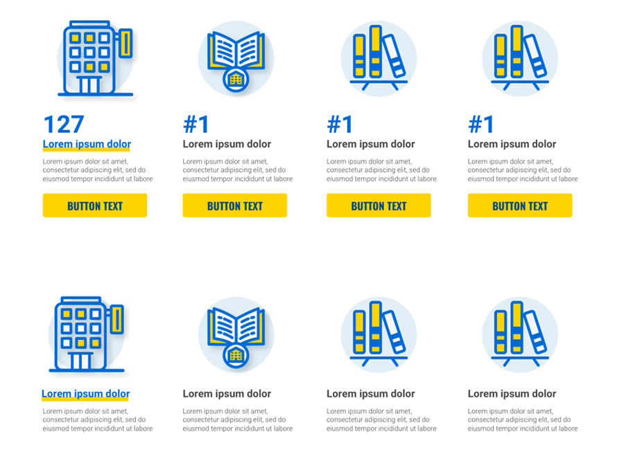
Icon rows with button and text link options
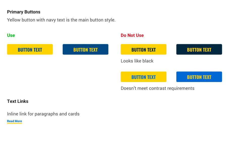
Button and text link styles
Icon descriptions
The Problem
UMKC's website was falling behind as a tool to recruit new students. They had great stories about current students and alumni gaining unique opportunities and experiences with an education from UMKC. But were failing to engage prospective students with these stories and show what sets UMKC apart from other schools.
-
Stale, lengthy copy
-
Neutral color palate lacking contrast didn't guide users through content
-
Poor row design cropped photos too small
-
Lack of visual hierarchy and large visuals that pair well with copy to tell a story
-
Inconsistent heading tags created unclear hierarchy for screen readers
My Approach
I started by talking with the web editors to identify their pain points when building new pages. They were receiving content that we didn’t have design solutions for. So they were having to force content where it didn't fit, or sacrifice important content.
I combed through the current website to assess how the current row designs were being used and what content needed to be more visual to engage and inspire prospective students.
At this time, UMKC hired an agency to undergo a brand refresh.
Before

Barkley's Research
In interviewing numerous current and prospective students, Barkley discovered that more and more, students are turning away from the old model of higher education. With skyrocketing costs and growing wariness of taking on student loans, students are turning to online education, trades, online certificates and other forms of learning.
Barkley could see that UMKC already had some unique offerings setting it apart from other schools, we just needed to change the way we sold ourselves.
Enter "Never Choose the Norm". Barkely delivered a brand guide highlighting UMKC’s strengths as an urban university appealing to prospective students desire for unique learning experiences with local KC businesses and plenty of internship opportunities and career guidance.
How I Incorporated Barkley's Research Into the Website
I wove these findings into the website by adding animations to highlight standout facts and figures that set UMKC apart.
I designed new modular rows that let photos shine and draw people into the copy. The new rows work together to create a seamless experience for all our content needs.
I incorporated animated text into a new header image so we had more room to highlight UMKC’s features and appeal to experiences prospective students are looking for in their education. The new design allows the copy and video to work together to tell UMKC’s story.
Other additions, including a new storytelling row with quotes and photos from current students, a customizable cards row with photos or icons, and call outs with animation, allowed us to better call attention to impactful information important to students.