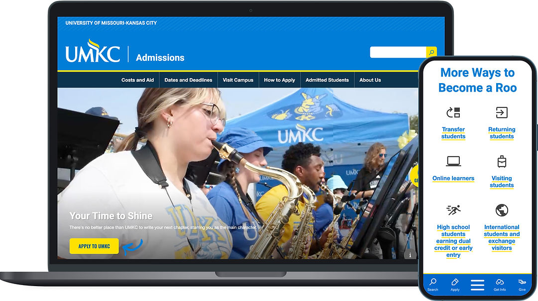
UMKC ADMISSIONS WEBSITE REDESIGN
Increasing applications to UMKC by 15%
The Problem
Due to the predicted decline in student enrollment in higher education institutions, UMKC's chancellor expressed a need to increase applications and enrollment to continue growing the University and its programs.
My team and I did an audit of the current admissions site page structure and analytics to determine if there were areas for improvement. During this research phase, I discovered quite a few pages that led users in a loop, and pages that had little content and only contained links to send users to other university departments.
My hypothesis was that the user flow was confusing and didn't prioritize key information students use to make decisions on where to go to school, potentially reducing how many applications were being submitted.
Before
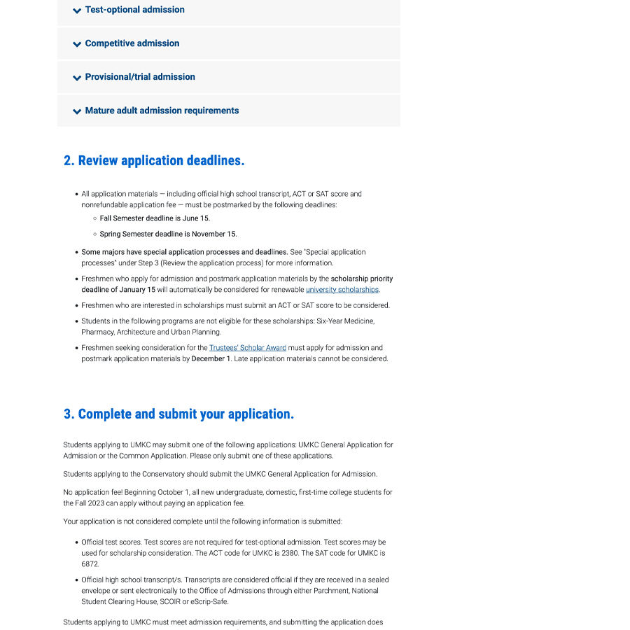
A portion of the previous how to apply page.

A portion of the previous admissions home page showing a link farm asking people what type of student they are.
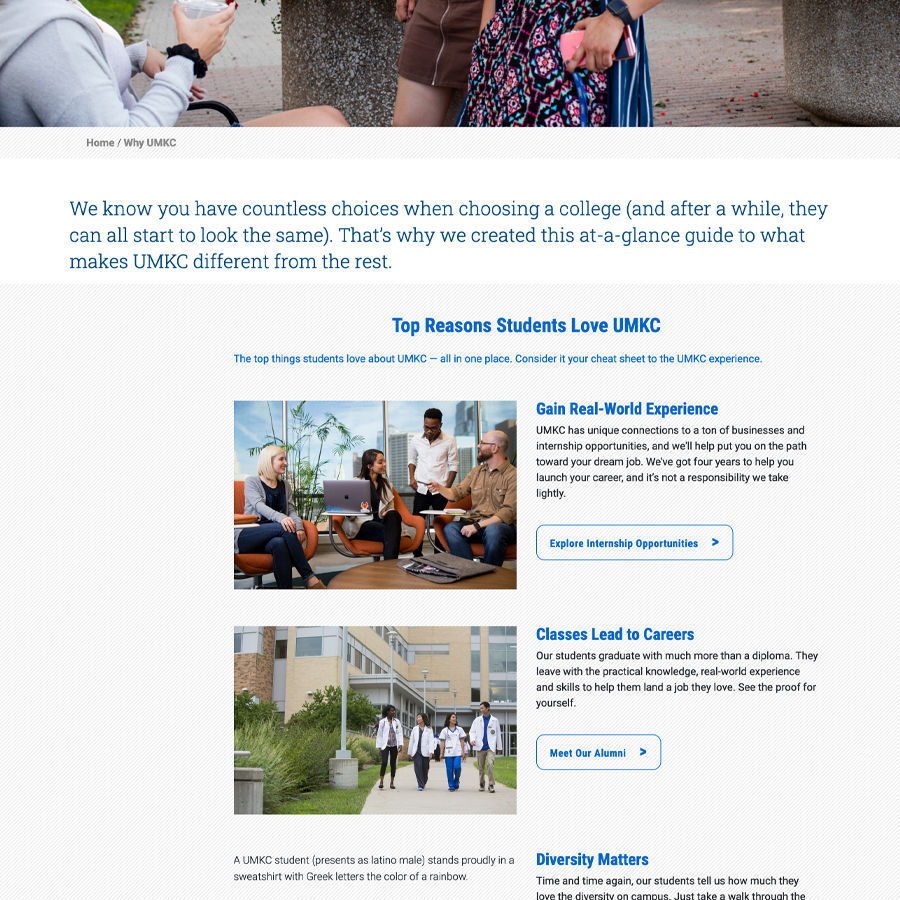
A portion of the previous "why umkc" page.
A portion of the previous how to apply page.
How do we increase applications?
To answer that, we needed to ask current high school students what criteria they're looking for to make a decision on where to go to college. As a team, we brainstormed interview questions, and identified key questions we needed answers to, including:
-
What about going to college scares you most?
-
What are the top 3 things you care about regarding your college experience?
-
Can you find how to apply and fill out a test application to UMKC?
Worrying User Test Results
We conducted a focus group of 6 high school students, who were family members of coworkers. During the survey, 4 of them didn't fill out a test application. They reported feeling overwhelmed by the number of steps and sheer amount of information on the "how to apply" page.
Where do we go from here?
The ux writer and I sat down together and decided to forget everything we thought we knew and throw out the current page structure. A "refresh" was out of the question, we needed to start the admissions website over.
I recommended we start with what prospective students reported they were afraid of:
-
how do I pay for school?
-
how do I choose a major that will lead me to a career path I'm excited about?
-
what's college life like, where do I fit in?
-
what happens after I graduate?
Our user flow started with a landing page addressing these questions. We personalized the experience for undergraduates and graduates, based on their differing priorities and needs. The purpose of the front of the site was to sell people on the UMKC experience and drive them to want to either request more information, or fill out an application.
Next Steps: How to Apply?
So now users have learned all they want to know about going to college at UMKC and have decided to apply. Enter the "how to apply" page, with 10 steps, multiple accordions, and endless scrolling, leaving users confused and overwhelmed.
Some of the steps on the page weren't actually relevant to the initial application process. They were steps they came after applying, so with buy in from the stakeholders on the admissions team, I recommended we moved them off the "how to apply" page.
Reducing the amount of content made a big difference already, and once I applied the new heading styles I defined in the website template redesign previously, we had a great start on a step by step, visually organized guide on how to apply. Our UX writer then simplified the content using plain language, and in our follow up round of user testing with the same focus group, all 6 users were able to fill out an application and said they a positive experience.
The new site went live in March 2024, and online applications have risen 15% as of March 2025.
What Would I Do Differently?
In a perfect world, I would have liked to do more user testing. We had no testing budget and were limited to a small focus group comprised of family members of our coworkers. I would like to be able to watch users navigate the whole site and find areas they may be getting lost or stuck.
My Role
ux design, ui design
Team
Beck Ireland: ux writer/project manager
Greg McMullen: developer
Gabi Sa Teles: team lead